Friday, April 8, 2011

Turn of the Century --Extended

In this story, one staircase begat another.  My staircase seen in the earlier blog, "Restoration Woodworking" was seen during a Summit Ave walking tour, and I was invited to take on this new project  --copy an existing  turn of the century staircase, as an exact replica and extending it into the newly developed attic space.


Here is a photo of the existing first floor entrance to the stairs.  It was a pretty swell house!


And here on the second floor, the the new stairs begin their extension into the attic space.  Of course, first we had to tear out the ceiling, while the clients were living there, with a child and expecting another.  Due date happened to correspond to our projected and hoped for completion date.  A little bit of "protection" was in order.


We contracted a millwork to cut the knives and mill matching trims and handrail.  A company we found on the internet copied our ballasters.


The converted attic completely matched the existing house, providing an additional bathroom, bedroom, study and family room.  


And basically, short of minor punch list stuff, we attained substantial completion by due date.

-Bill

Tuesday, April 5, 2011

kitchens

So, its been 6 years already, six years of exclusive, well, mostly exclusive, designing and installing kitchens, Ikea kitchens (those previous photos are all Ikea kitchens), combinations, variations and customized derivations of Ikea kitchens too--  a lot of kitchens.  You can do alot with Ikea's product.  Our company has been a certified installer of Ikea kitchens throughout the Twin Cities area--  has been until last September, when Ikea corporate decided for corporate reasons to unify activities with a nationwide installation service. 

Hey, it was a great run. 

I did install many a kitchen, honed my design skills,enjoyed many customers and learned the kitchen world inside and out-- tweeking, twisting and creating customized results with standardized off the shelf products.   I produced suburban woody kitchens, severe hipster kitchens, middle class family kitchens, compact bungalow efficiency kitchens, strictly functional office kitchens, as well as minimalist modernist, exclusively sophisticated "state of the art" euro-designer, Brad and Angelina looking kitchens.   Styles are languages, you have to use one to make art.

I'll show you what I mean in later posts.

-Bill

Monday, April 4, 2011


               kitchen


-Bill

Tuesday, March 22, 2011

Restoration Woodworking


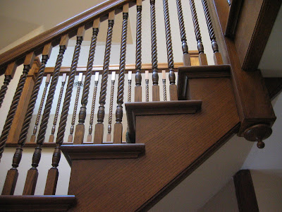
Restoring this old staircase was quite a task.  Originally built in the 1890s on Summit Avenue in St Paul.  It was the front staircase linking 3 floors in a beautiful but throughly exhausted Victorian row house.   Having bore the ravages of American urban history, this opulent single family home had become a chopped up apartment house squalor.  And the staircase was a dilapidated rickety nightmare. 


Everything on this staircase had to be disassembled and rebuilt with new landings, new stringers  ...even the entry had to be moved back to its original location.


Few of the original parts are in their original location.  The staircase had been so cannibalized and butchered, that this present restoration is the product of a combination of stairparts, both original and salvaged from a second set of staircase parts saved from another unit in the set of row houses.  Of course, there were also a number of newly fabricated parts.  All the posts are new, with new moldings made to match.


I would guess that a good 80% of the parts that were used for this reconstruction are original to the 1890s row house, cut from the same trees and milled back in the day.  All the parts were refitted and installed in this revamped ensemble and,of course, newly refinished.


    -Bill

Thursday, March 10, 2011

Lake of the Isles Attic Build-out


Here are some shots of one of our favorite projects. It started with an unfinished attic space and some schematics from Rehkamp Larson Architects. The project included two bedrooms, a bath and an office. We also added several skylights and some built in cabinets. Everything went up two flights of stairs or as you can see, through the window!


After the project was complete, the clients were kind enough to provide letters of recommendation. Here are some excerpts:
"The project, begun in October of 2005 and completed in March of 2006, included the creation of two bedrooms, a bathroom, and an office.  It also involved complicated structural reinforcements, a small 3rd floor workspace, and elaborate trim detail, all completed from only rudimentary architectural drawings."
 Built in lighting
"... the work was done professionally, carefully, and up to high standards.  The finished space looks absolutely beautiful, and we have received no end of compliments and oohs and aahs."


"There was a minimum of disruption of our daily lives, and they were always courteous and easy to work with, including being warm and friendly with our kids and our dog." 


"Despite the fact that we had few concrete plans for exactly how the space was going to turn out, Bill worked with us to help us figure it out, and he was always flexible and adaptable."

"Most importantly, we always felt that they were entirely trustworthy—they worked hard, charged fairly, billed honestly, and dealt with us professionally.  We actually miss having him around!" 
 We miss them too.

Wednesday, February 2, 2011

Ultra Custom Ikea Galley Kitchen


 Doesn't look like an Ikea kitchen and  doesn't feel like an Ikea kitchen.  Its not to be found in the Ikea catalog, but....  well, give up?  it's half Ikea, and half not.
The boxes and the drawers and hardware are all from Ikea, but the doors, coverpanels, and drawer faces are all made by Scherr Cabinets www.scherrs.com/ in North Dakota.


The client wanted to use Ikea cabinets, but she didn't want to use their door styles.  She wanted a white oak, rift cut veneer doors with a vertical grain pattern which would  flow and continue through the individual doors.  Its a classic architectural look, and very beautiful too.


I would like to claim that I figured out how to have these doors manufactured, but the client already had found the supplier.  I just had to make sure everything fit.  It would have been pretty easy too, but, of course, in order to make these cabinets fit as envisioned, we had to do a bit of customizing of the boxes.  And then there was that smart idea of the long horizontal open box above the hood.  And then---   it was a great collaboration.  A gift that kept on giving.


Corian countertops and the best deal I ever heard of in an undermount sink from some online supplier.
My client has some resourceful skills.


 My client also found the pulls (handles) from Restoration Hardware.


And finally there is the radiator cover window seat, with a built in recycling drawer to complete the total design.


     Bill

Sunday, January 30, 2011

Minneapolis Bungalow

A sure sign of a successful project is when the clients call you back for phase two. I was the lead carpenter on a master suite addition for this south Minneapolis bungalow. That first phase reorganized the first floor layout, created a beautiful kitchen,  (w/ custom cabinets by Choice Wood) and a master suite on the second level.

5 years later they called me back to remodel the basement, the two remaining bathrooms and attend to a “laundry list” of other upgrades. When presented with the plan I suggested we add a heat recovery ventilator since we had tightened up the house considerably.

Here are a couple of shots of the finished product.   

Jeffrey 

 Kitchen


 Finished Basement


 Main Bath


Marble in the Laundry

Monday, January 24, 2011

Last Date


Last date?  Well, this was my last date as designer and installation technician under the moniker of Certified Ikea Design and Installation Specialist.  (the qualifying term being "Certified")  What a great dance, though.  I think this kitchen turned out to be quite the beauty.  I just finished it Saturday.  It's interesting how a design begins.  I left my first meeting with the client with a few ideas--  Japanese, white, Ikea Abstract cabinets, a 4 foot wide Liebherr refrigerator, the beautiful trees of Theodore Wirth Park in Minneapolis outside the windows of her future open-plan revision of  a classically confused 1970's pseudo split level home.  All this as well as one cool japanese Muji mechanical pencil I walked out with.  My client had some major ambitions as well as a terrific vision.


So, I suppose the criteria listed seems pretty simple and clear, but there is always a challenge fitting desires into a limited space and there are always limits. Sometimes the subjective idea is just a touchstone or a place to begin, identifying the client with a sensibility and stylistic preference.  Working the space is a process, sometimes offering solutions that stray from the subjective beginnings, but are more like what they wanted than what they thought. Great resolutions can often be a surprise.  The only fast rule that I regularly return to is “always opt for the simpler solution” (even if it requires extra work). 


I knew that the new floor plan was to be open and new windows would bring in a spectacular forest view as a dominant element to consider.  I wanted a sweeping lateral motion and a very open feel.  The client wanted a peninsula with seating and had already picked out the sexy Euro appliances.

We did go through our share of variations and revisions, honing the relationships, setting the visual rhythms of the doors and working out cabinet placements and functions.  Kitchens require a lot of care.  There is a lot going on. Multiple systems all come together and they need to work perfectly.  Restrictions arise where you least expect them and then there is the all important budget.  The final solution must feel “right” to the client, the most important “system” to fit in.


I don’t know where “Japan” went, but we do have a clean precise minimalist look.  The client chose a beautiful custom concrete with crushed glass countertop. ( made by Dave Foley of Mankato, MN http://www.foleyconstructioninc.com/It’s a beautiful grey/tan color. The floor is a knotty oak engineered plank-style flooring which runs through the house.  Together these elements bring the right warmth into the room to harmonize perfectly with the forest views outside.  Hey, that’s kind of Japanese. 

Bill

Monday, January 17, 2011

More on Barb's house...


Barb wanted to make her house as efficient and low impact as possible. She was also determined to include many non-standard  products or features as practical. Some on her list we threw out but we included a surprising number and added others as we went. I thought it would be useful to list some of those unique features: 

Site + Location

*    Centrally located on an infill lot
*    Permeable paved walkways
*    Raised gardens
*    1400 gallon rain water storage system
*    Rain garden

Shell

*    Integrated footing and foundation drainage
*    Faswall ICF system (R-23)
*    Flyash concrete
*    FSC certified framing
*    Fiberglass double and triple pane windows
*    R-60 foam + fiberglass roof insulation (roof)
*    Heavy gauge metal roof
*    EPDM flat roofs for green roof planting
*    Paperless drywall

Systems

*    260 SF solar thermal array w/ 240 gal storage for both space and domestic heating
*    2.8 kW photovoltaic system
*    Infloor hydronic heat both levels
*    High efficiency boiler w/ instant domestic hot water as backups
*    Low flow fixtures
*    Energy star appliances
*    Passive cooling tower with interior “borrowed light”
*    Integrated HRV and AC system (high efficiency of course)

                                                 staircase/lightwell

Other features

*    Polished concrete floor (lower level)
*    Bamboo floor on gypcrete  (upper level)
*    Recycled kitchen & bath cabinets with
*    Recycled granite tops and
*    Marmoleum vanity tops
*    Central vacuum, vented to exterior
*    Clay finish interior walls
*    LED cabinet lights
*    Low VOC finishes throughout

That's all I can think of off the top of my head. If you have any questions feel free to post them here, or contact us for discussion or even a tour!

-Jeffrey

Wednesday, January 12, 2011

Barb's Green House


I had dinner at a client’s house last night. It was my first social visit since we met in 2008 look over her new house plans. Her idea was to contract the work herself, but wisely realized that having an experienced construction manager would be a worthwhile expense. From dealing with the bank, the subs and the inspectors she would have someone on her side who had been there before, who understood the terminology and would advocate on her behalf. We hit it off and I was hired.

Now two years later I’m sitting in a home that I built from the ground up. Not that I did ALL the work mind you, but as things developed I did a lot. From detailing the drawings and hiring the subs, to insulating the slab, framing the interior, installing the windows, building the finished stairs, putting in the recycled cabinets and building a few new ones to match. I’d had a hand in nearly every decision, and every square inch inside and out. The client was the best: steady, rolling with the natural ups and downs of a large custom project and kicking the project in the a$$ when that needed to be done. She moved in before Thanksgiving 2009.

So it was one year ago this month that our project won the 2009 Solar House of the Year by the Minnesota Renewable Energy Society. There are still a few things on our list which we will complete as money allows but for now it’s a spacious, snug and cheep to operate home for Barb & her mom.

I’ll be blogging some details about this project as time allows, and rest assured, they’re details you won’t want to miss…

-Jeffrey

Wednesday, January 5, 2011

We are the pros from Dover

You _know_ the construction economy is in recovery mode right?

Bill and I have been looking for ways to better connect with our clients and friends and one of our clients suggested we move from a static web format to the more dynamic web log format. Look for images, ideas, projects and solutions. We promise to keep it fresh and promise you won't be disappointed.